 |
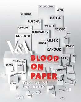
Blood on Paper - the Art of the Book Victoria & Albert Museum 15 April - 29 June 2008 |
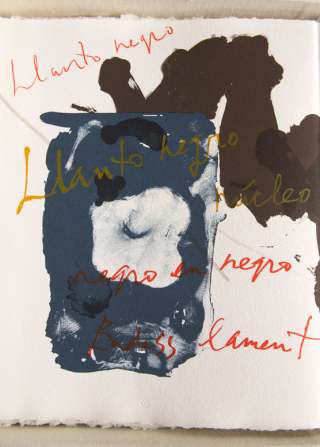
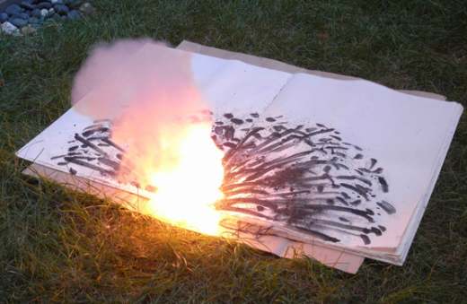
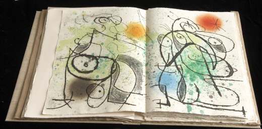
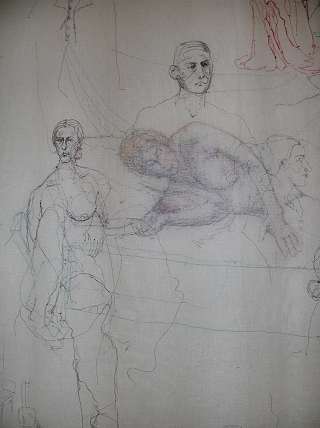
I went to this exhibition with great expectations, partly because I love everything to do with books, from reading to making, and partly because I loved the title. Anyone who has ever written a book can relate to that. After the first circuit, I was a little disappointed. Yes, there were wonders (see below) but some pieces seemed totally divorced from any idea of a book. I then remembered book courses I have taught, which I always started by asking the students, 'what is a book?' and then challenged their answers. Lots of ideas for a 'non standard' book were exhibited. So, with the feeling of having fallen at the first fence, I started again with a much more open mind. The open mind baulked a little at Damian Hirst's 'New Religion', a series of cabinets and chests, which did little to inspire me. However, revival came in the form of 'Suicide Fireworks' by Cai Guo Qaing. There was a video of his book-making process, which involved inserting an explosive into the book and retiring to a safe distance before the big bang (see below). Could this be a metaphor for the mighty power of the word? Loved the results of this anyway, and was reminded of Val Campbell-Harding setting fire to a telephone directory in the name of art. Something that was particularly striking in many of the works was the way that text and image merged so beautifully. This is illustrated in Robert Motherwell's book shown right. The words become another element of the painting. They are used to blend or to be a focus but rarely in the conventional manner of typesetting. Conversely, the Matisse book had no words at all on the double-page spread shown. |
 |
  |
|
'Courtesan Grotesque' (above) was a comic novel of the cavalier Adrien De Monluc. In a way, this book by Iliazd (the adopted name of Ilia Zdanevitch) illustrated some of the frustrations of the exhibition as you longed to turn the pages to see more or, in this case, to comprehend a story. But is this necessary? Does separating a double-page spread and allowing it to stand alone make a more interesting point? I loved the movement in these two pages. Anthony Caro's metal 'books' were interesting but I found them to be irresistably reminiscent of flatbed scanners and had trouble getting past that concept. There were some big, big names in the exhibition and I did enjoy Matisse, Miro, Picasso and Kapoor. Alberto Giacometti's sketchbook was wonderful. Some of the books of photographs left me rather cold. However, Paula Rego's work lends itself so well to books and I hadn't realised that she produced illustrations for Peter Pan and Jane Eyre. The star of the show for me was the work of Anselm Kiefer. He has always been a hero of mine and we've paid homage in galleries as diverse as Tate Modern and White Cube. His books were an amazing change of scale from those previously experienced, although 'The Secret Life of Plants' is a big book by anybody's standards. About 2 metres in height, it stood at the entrance to the exhibition, a massive lead construction. It is based on the outlines of constellations and their NASA numbers, combined with plants representing the earth's beginnings. His smaller books (still big) were displayed flat and oh boy were they wonderful. The book shown below, 'Steigend Steigend Sinke Nieder' ('Rising Rising Sinks Downwards'), depicted towers, often used by Kiefer. Some were rising, some falling, all held within a marvellously textured framework. Of the other books shown, one was quite flowery but still held the feeling of a powerful image - nothing fragile here, and one was very abstract. 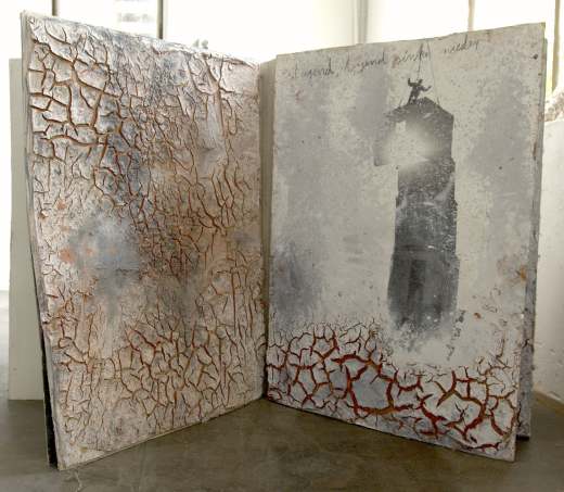 I was glad of my rediscovered open mind and the fact that the exhibition made me reconsider all my pre-conceptions of what constitutes a book. The exhibition demonstrates well the turning point when artists ceased merely to illustrate books but transformed the entire book - words and images - into a unified entity, a virtuoso masterpiece. I would recommend a visit to this FREE exhibition. Top marks, V & A - but I wish you'd made the catalogue cheaper. |
|
Somebody made a comment on my blog that they thought this exhibition was more art than stitch. I found this quite thought provoking - isn't this what we want if we are to be considered textile artists rather than 'just' embroiderers? Does the term embroidery downgrade the pieces we produce? This argument, along with the art versus craft debate, will run and run. The Embroiderers' Guild attempts to reconcile the dichotomy by promoting two major exhibitions 'Art of the Stitch' and 'The Riches of Stitches'. Of these, and as the name suggests, the latter is an event with stitch well to the fore. This approach does seem to demote stitch and there is no doubt that 'Art of the Stitch' is the flagship show. Enough of the musings - on to the review. Yes, there were some weird offerings that didn't seem to fit with art or stitch and I always have a problem with hastily constructed doll-like figures. However, overall I thought it was great - one of the best 'Art of the Stitch' exhibitions we have ever had. There always has to be something to jar or the thing would be too bland and, often, the weird bits haunt you more than the ones that have greater eye-appeal.  One thing that really stood out for me was the part played by drawing. Good drawing appeals to everybody; it should underpin all that we do and there was so much here that was good. In fact, the far corner of the room was a wonderful treasure-trove with the monochrome works all complementing each other and thus making a greater impact than the sum of the pieces. 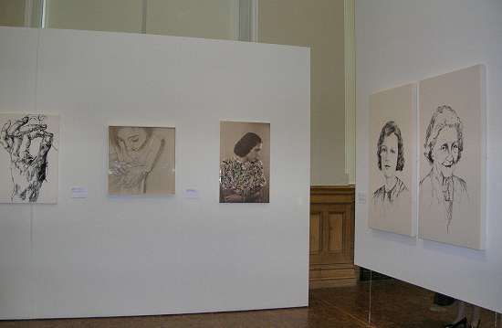 I loved the idea of Ilaria Margutti and Rosalba Pepi combining their talents, with Pepi emphasising Margutti's beautiful drawing with well-considered stitch. 'Cath', by Andra Cryer, was also an outstanding idea with the two portraits of her mother-in-law, showing her in youth and old age. They were exquisitely drawn with stitching using threads withdrawn from the subject's clothing. A strong sense of the affection of the artist for her subject engaged the viewer. Here too, Rosie James captured an essence of Durer with her version of his famous Hand. Her other work, chosen as the publicity image by the Guild, was also breathtaking and, in 'Tourists Contemplating the British Museum', she had caught the feel of a crowd: the individuals merging into a whole, the way those retreating were depicted in colour with little detail, most of all in the lively portraits of the girl with the backpack, the guy grabbing a hasty drink - the chap fed up with waiting. This piece had it all. |
|
I always enjoy the sketching style of Shizuko Kimura and she delivered the goods in style with 'Studio View. And the cat came too!' (below left). It was well observed, with an interesting double-layered approach and her usual impeccable drawing skills. Other examples of the drawing theme were seen in work by Tilleke Schwarz with her graffiti, this time generated by newspaper cuttings, while Maria Ryan's 'Skaland Bedehuf' evoked childhood and fantasy. Suzanne Gregg's 'Vases' continued the sketchy theme with intriguing work using mono-filament thread on soluble fabric. Sarah Brown's '84 Hours' (below right) was based on the story of William Wood, a book-binder sentenced to two years in Newgate Prison for asking to have his working week reduced from 84 to 83 hours. Sarah worked from 6am to 8pm for six days to make the piece in 84 hours. |
|
 |
 |
Continuing the drawing theme, I liked the tea-towel observations of both Mary Cozens-Walker - looking at the obsolescence of the tea-towel and using it as a canvas for a tongue-in-cheek portrait of wartime utility. Then there was the endless tea-towel of Caren Garfen, this time used as a metaphor for all the tasks women had to do. We can all relate to that and the witty little notes were a clever touch. The title, 'Womanual, All Done and Dusted', struck a chord too. | |
Cindy Hickok's work is always fun and this sometimes masks her incredible skill and technical brilliance. In 'The Past Supper', it is a challenge to the viewer to pick out figures (and sometimes food) from famous paintings.  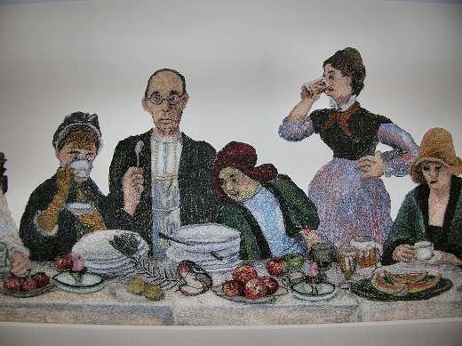 | |
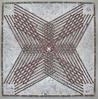
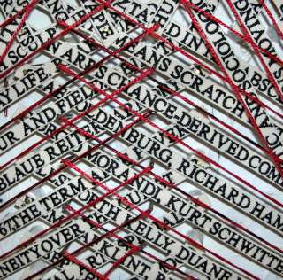
Sarah Burgess's work continues her theme of hands and gloves with 'Pulling on, Slipping off' demonstrating the correct way to don and remove gloves. Beth Knight's quilt 'Drunkard's Path' was made from Guinness cans using the drunkard's path pattern - a clever touch. Michael Brennand-Wood's entry was called 'Art of the Stitch' (below left, detail below right) and used strips of woven words which related to artists, art movements, philosophies etc. I loved the way in which woven tapes intersected, mixing up these subjects as they overlapped. |
|
 |
 |
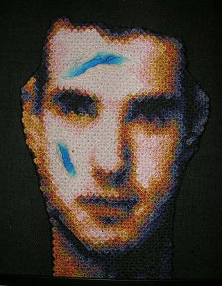
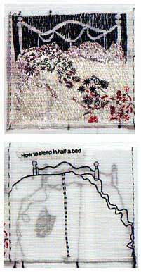
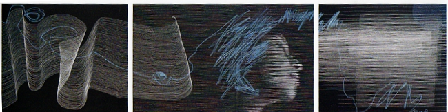
This review is already too long so I can only give the briefest of mentions of other work I enjoyed: Jane Kenyon's colour study, Jill Flower's ruffs, Elizabeth Couzins-Scott with her wicked 'Sinner's Handbag' and Sarah Brown's amazing book. Zara Merrick's fairytale, cartoon-style story of Queen Bernice was so good at telling its tale that one almost forgot the technical excellence. A small girl and I were both very taken with this and she confided that she was going home to draw some of her stories in a similar way. Full marks for inspiration, Zara. Eleri Mills's work goes on evolving and her submission was a dream-like landscape entitled 'In the Garden'. Long stitches over a painted base gave a real sense of movement and the landscape appeared to glow with an unearthly light - wonderful stuff. The Coats Crafts Anchor Awards were well judged with first prize going to Inga Liksaite from Lithuania. Her 'White and Blue Lines' (see bottom of review) showed an amazing use of stitch with lines evoking waves and a serene face floating in a breathtaking triptych. Second prize went to one of my favourite artists, Jane McKeating, for 'How to Sleep in Half a Bed' (below right). This eight-page rag book was a biting social observation of the adjustment required at the end of a long marriage. Third prize went to American Scott Ellegood (below left) with some of the most amazing hand-stitching I have ever seen. |
|
 |
 |
Was it more art than stitch? I found it interesting that my husband (very fond of abstract art, less turned on by stitch) didn't disappear as he usually does when I review exhibitions. In fact he raved and was reluctant to leave when our parking time was up. So, lots of inspiration, lots of stitch and, most important, lots and lots of art. |
|
 |
|